Business and Creative Strategy

Sailing Past “Blue” for a Dynamic Rebrand

From fragmented brand identities to a research-backed visual system and scalable design infrastructure.

Brand Strategy // Stakeholder Pitches // Creative Direction

Colleague Recommendation

“She sees both the fine detail and the broader vision–an invaluable skill that allowed her to build consensus, keep projects mission-aligned, and deliver polished, on-brand work with remarkable speed and accuracy. She collaborates seamlessly across teams, anticipates needs before they arise, and approaches every assignment with professionalism and genuine curiosity.”

Donna Jacobson, Visionary Nonprofit Leader, Former Supervisor

Overview

TriMetrix, a woman-owned small business specializing in health and human services, had reached a pivotal moment in its growth where its various identities—a parent company, a primary division, and a subsidiary—needed to finally be visually unified.

Duration

1 year

Role

Content and Design Manager

Brand Strategy

The initial executive vision was a simple aesthetic update: changing everyone’s primary color to navy blue to create a sense of unity. However, I recognized that a true rebrand required more than a fresh coat of paint; it was an opportunity to build a strategic visual system that would differentiate the firm within the competitive health and human services sector. I advocated for a deeper approach, securing the green light to lead the organization through its first-ever comprehensive rebranding process.


My approach began with foundational research, starting with an exhaustive internal audit to understand our current state before looking outward to analyze the broader landscape of our competitors. By breaking down the branded elements used by other consulting agencies in our sector, I was able to demonstrate to our leadership what truly defines a brand and where our unique opportunities for differentiation lived. This research-backed methodology shifted the conversation from personal preferences to strategic alignment, ensuring that the final brand wouldn’t just look professional, but would actively support our mission-focused objectives.

3

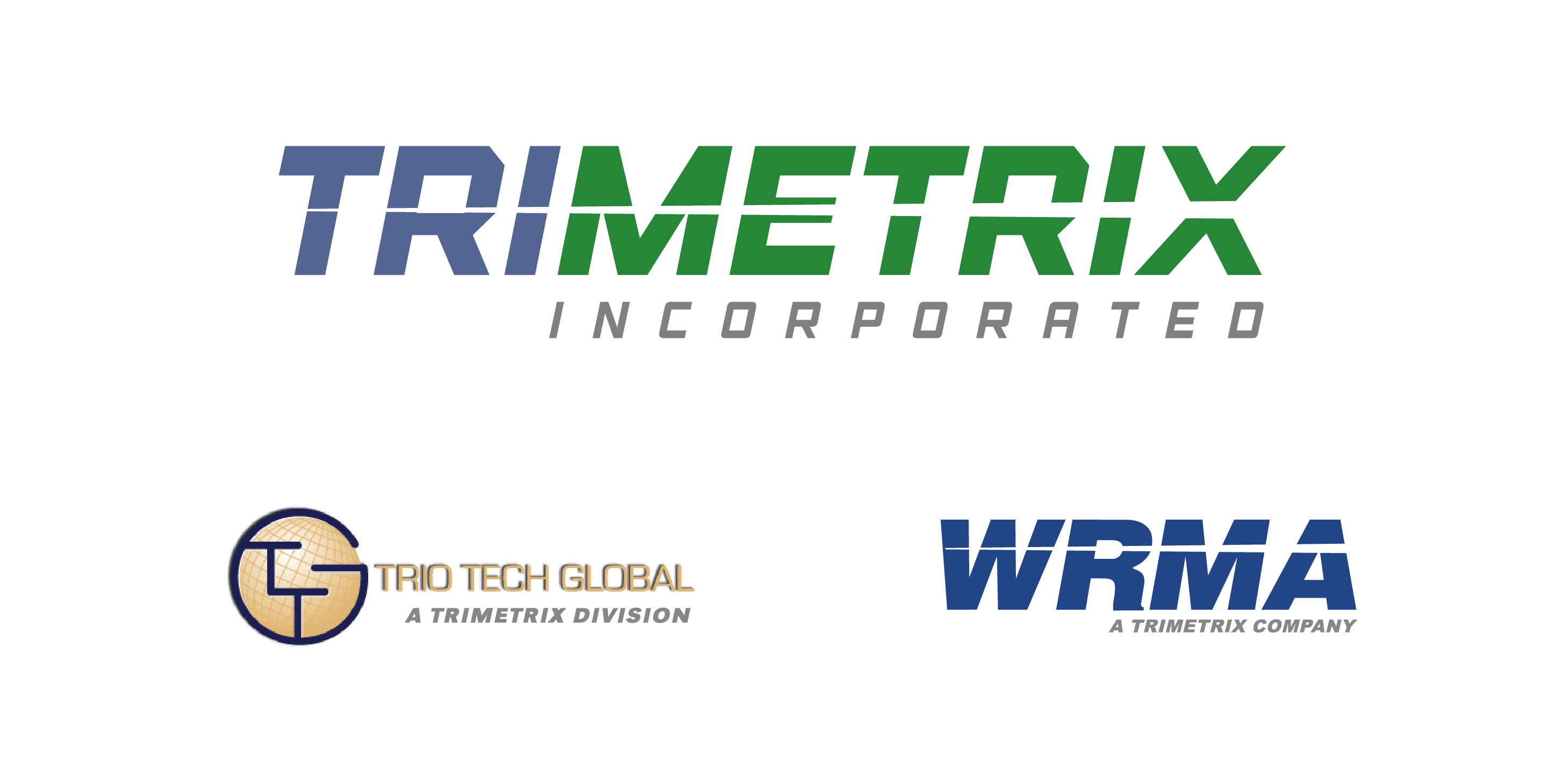
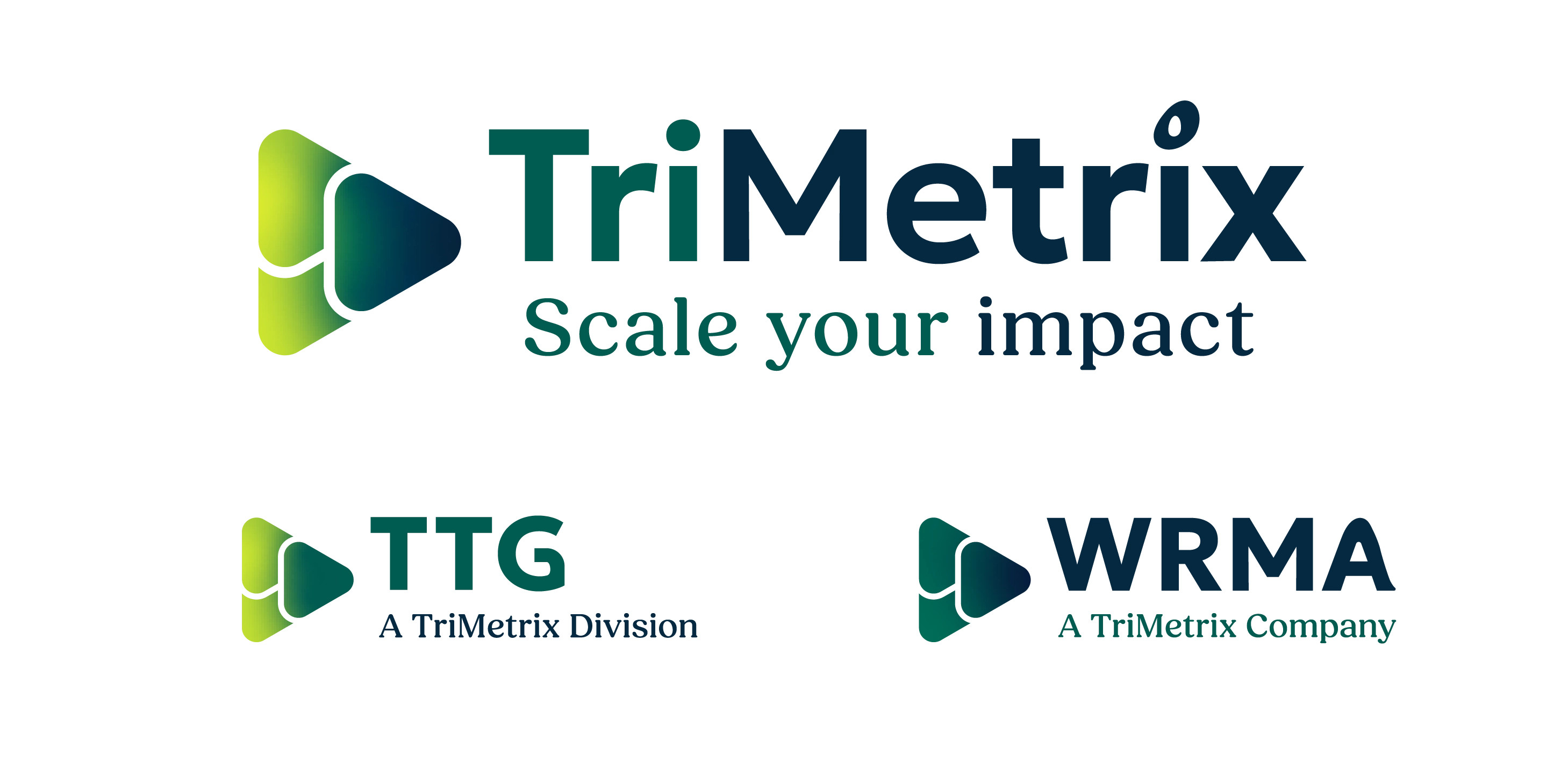
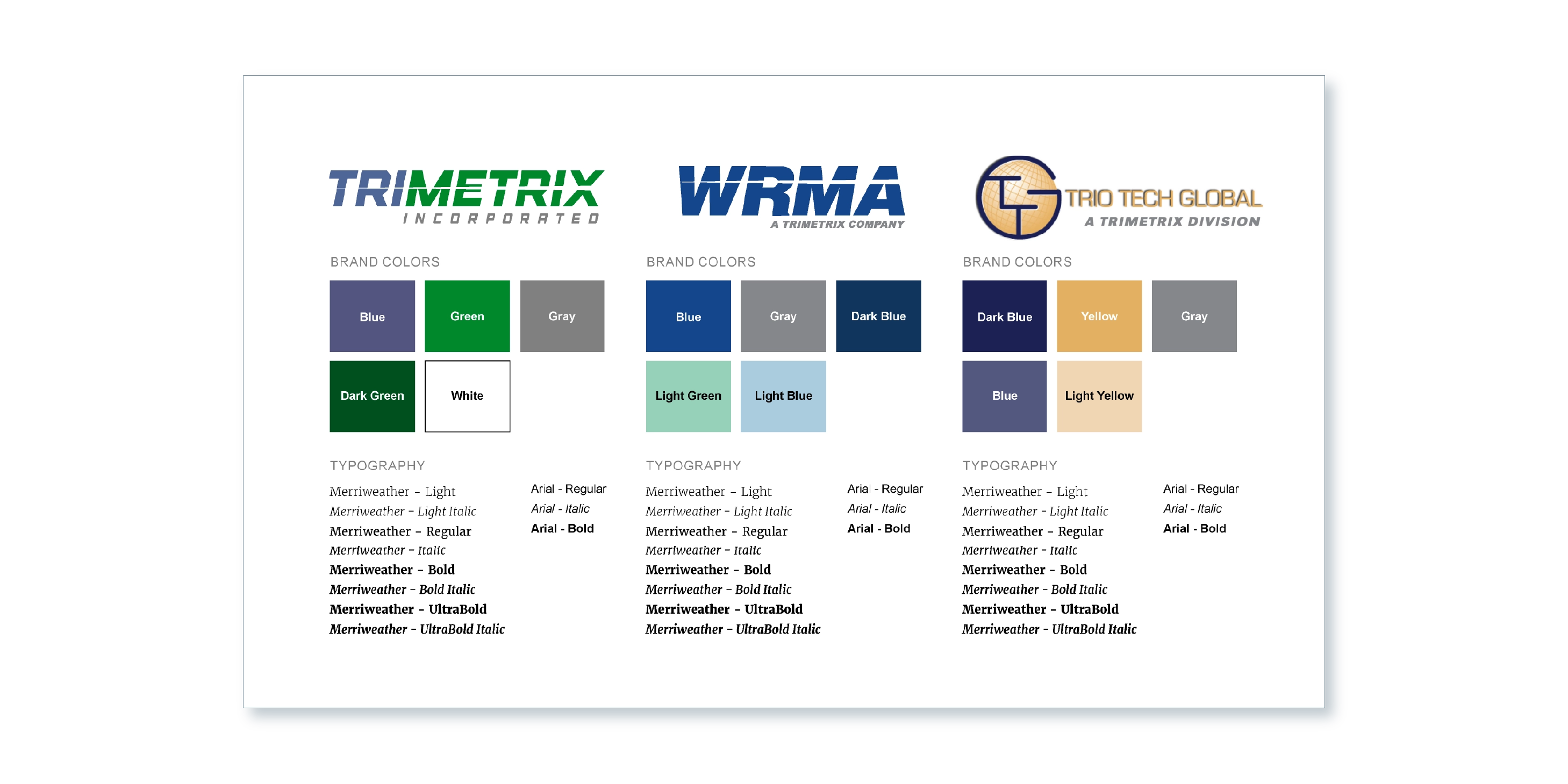
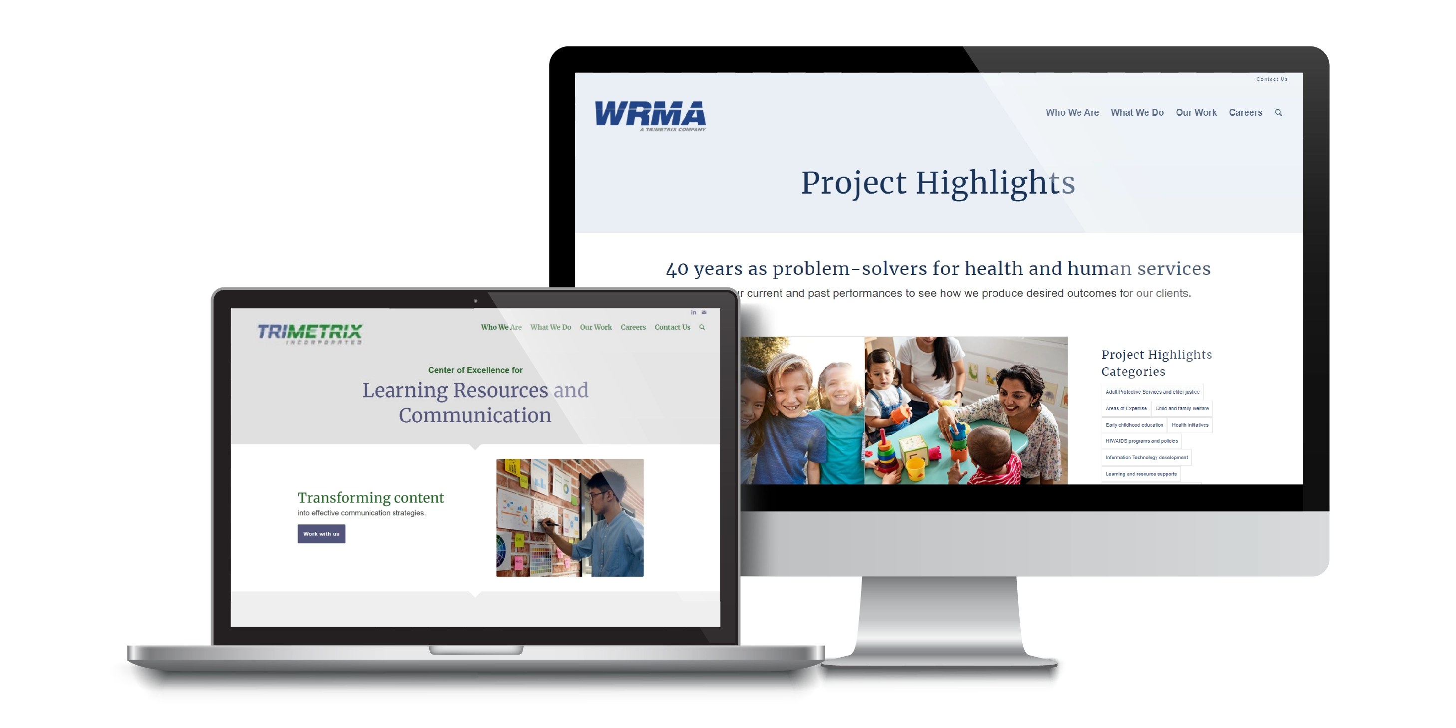
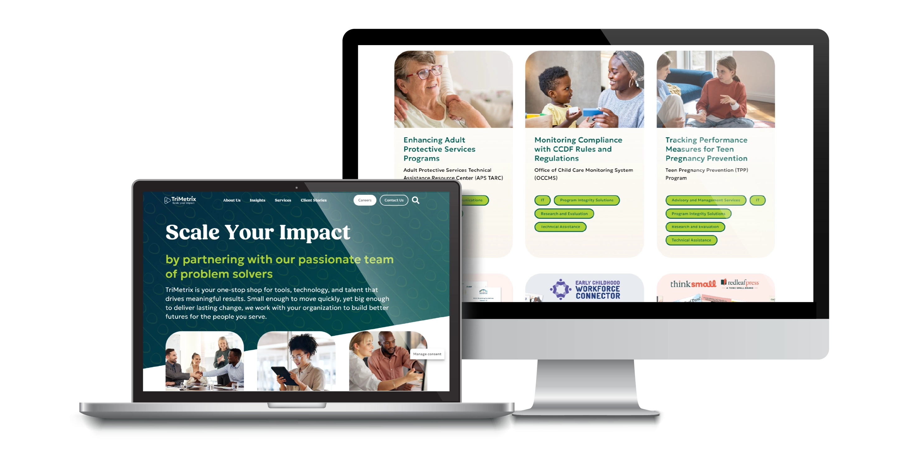
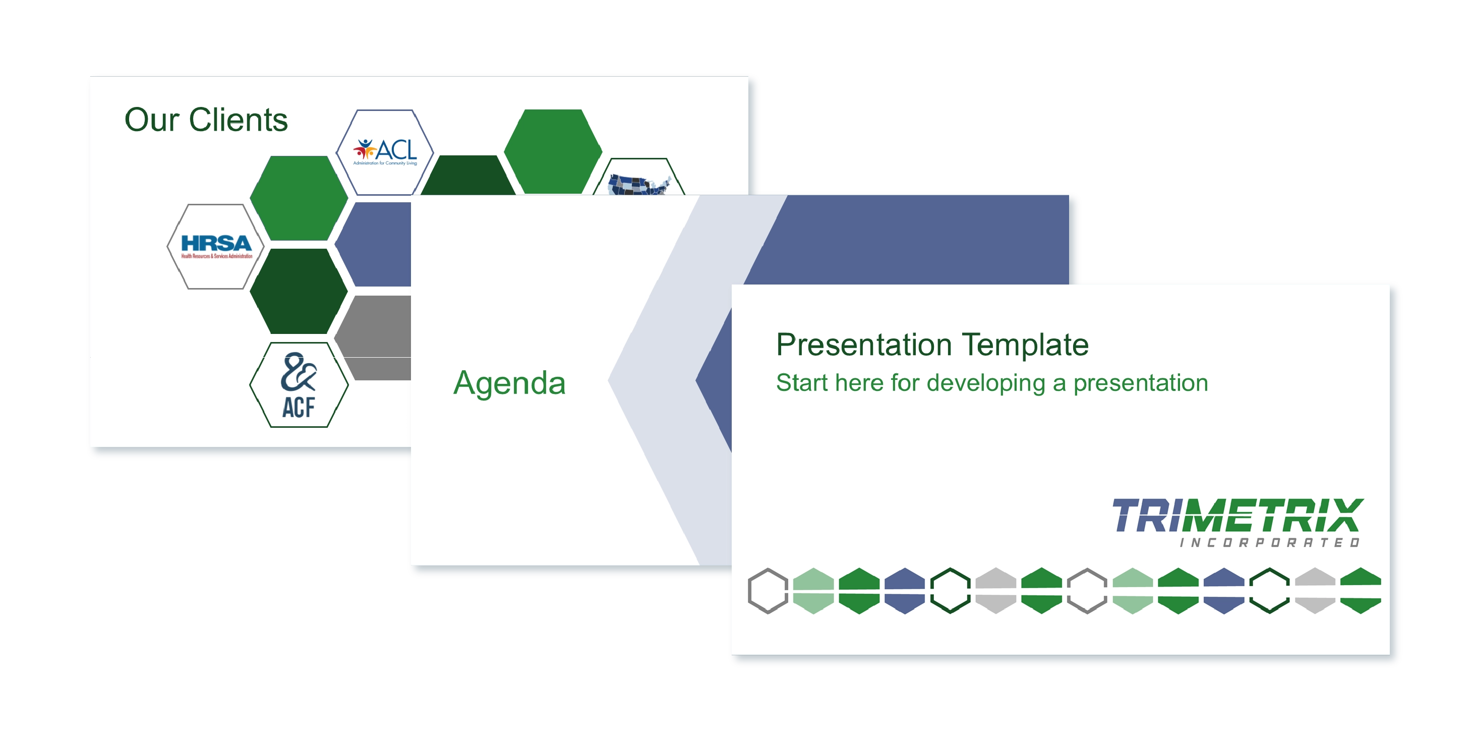
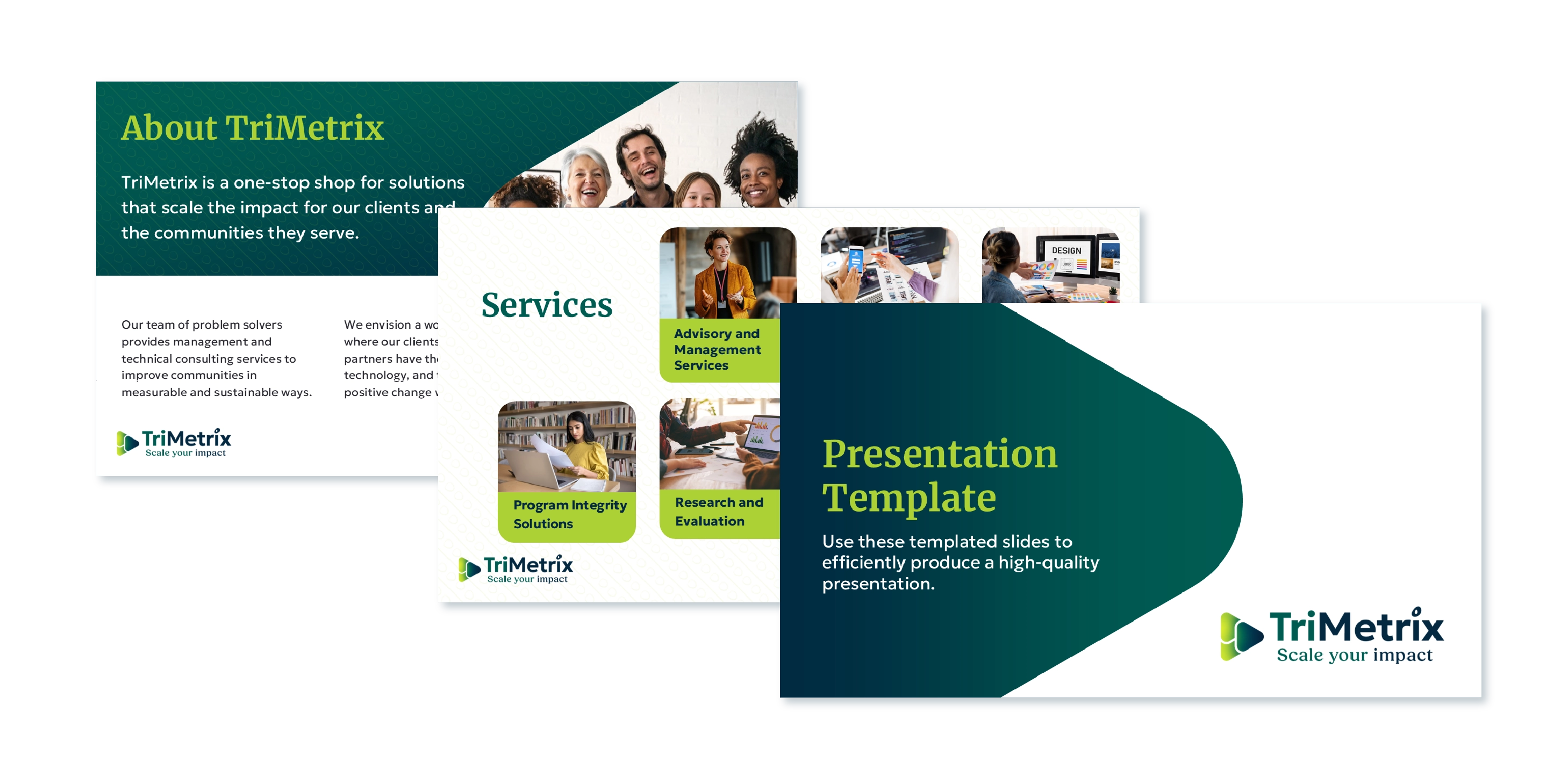
Organizational Unity

3 business identities unified under a single, shared visual language

11

Strategic Insight

11 competitors analyzed alongside a full-scale internal audit to drive market differentiation

13

Project Velocity

13-month project plan executed from research to multi-brand and website launch

Stakeholder Pitches

As we moved into the visual phase, color quickly became our first major strategic roadblock. While navy blue remained a staple for its stability, I knew we desperately needed a high-contrast partner to ensure our designs were functional and inclusive. I intentionally framed the inclusion of a bold secondary color not just as an artistic choice, but as a critical business decision. Because accessibility was a core service we provided to clients, I argued that our own brand must lead by example, requiring a palette that could easily meet WCAG color contrast ratios across all digital and print mediums.


Navigating these executive conversations required a mix of empathy and data-driven persistence. When my initial proposal for an orange accent color was met with hesitation, I didn’t see it as a “no,” but as an opportunity to refine our shared vision. I had already prepared a secondary option—a sophisticated duo of bright green and sepia beige. This preparation paid off; the new palette was an immediate hit, satisfying executive tastes while providing the technical flexibility our designers needed. To ensure this success was sustainable, I incorporated clear accessibility standards into our brand guidelines so that every future design would be inclusive by default.

100%

Consensus Building

100% executive approval by framing the identity as a strategic business requirement
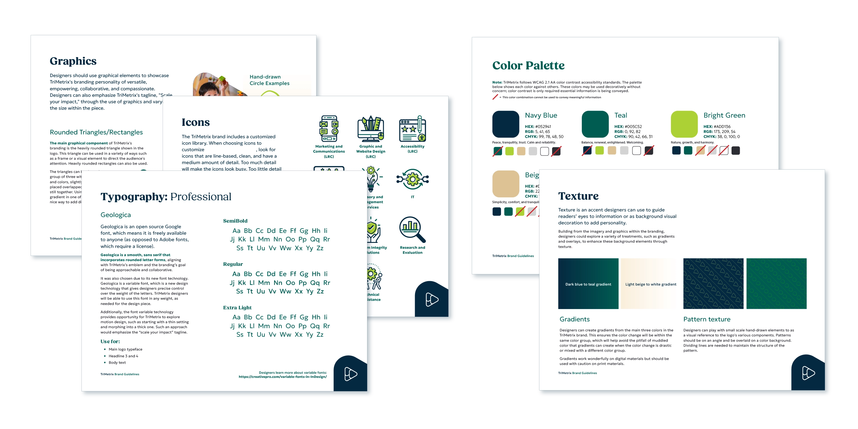
2.1

Technical Standards

2.1 AA WCAG compliance integrated into the core brand for inclusive design
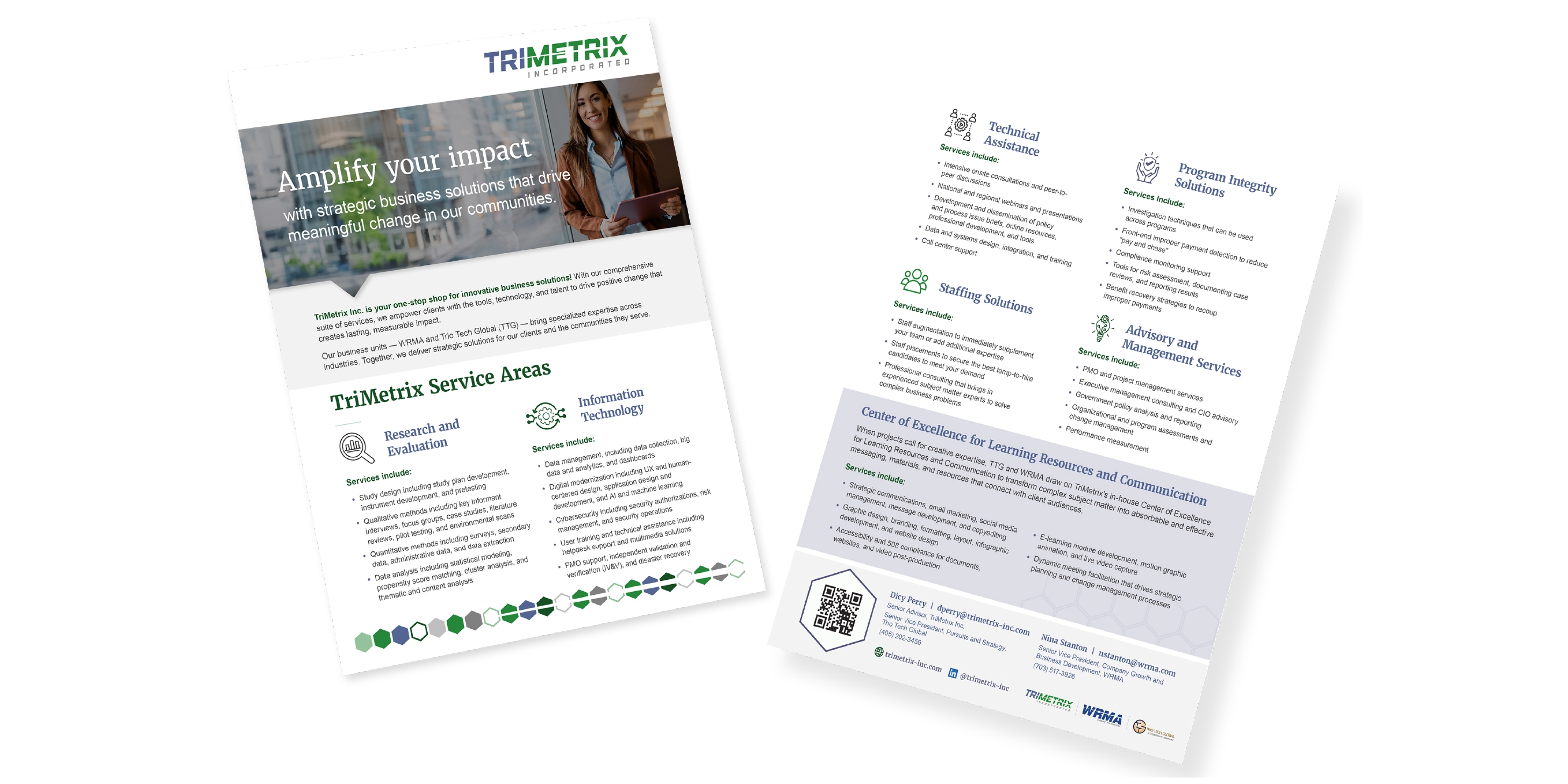
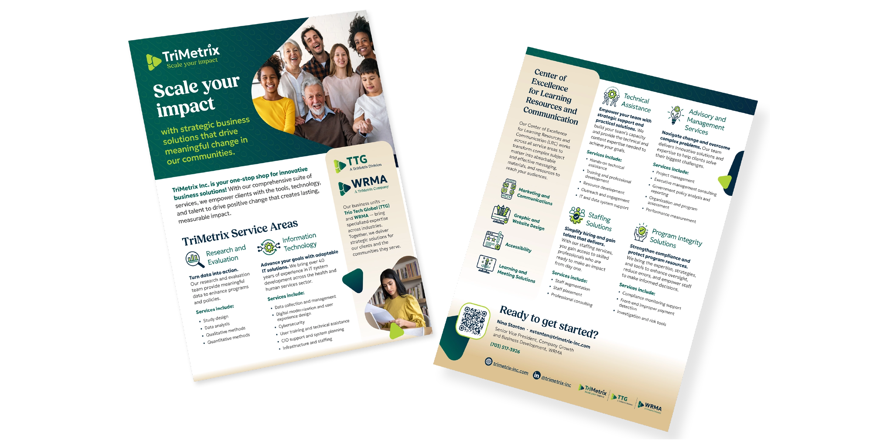
2

Strategic Agility

2 color directions prepared to pivot from hesitation to an immediate hit

Creative Direction

With the strategic foundation set, I directed the development of a layered triangle visual system that served as a direct nod to the TriMetrix name and our new tagline: “Scale Your Impact”. This approach was intentionally dynamic, featuring subtle hand-drawn elements that signaled our commitment to serving human-focused, mission-driven organizations. I led my team of three designers through the complex process of documenting and implementing our new branding standards including typography guidance, icon styles, and motion and imagery instruction, ensuring that every touchpoint felt like a cohesive part of the new TriMetrix story.


To ensure the brand was actually usable for the rest of the organization, I focused on building usable resources rather than just a style guide. We launched a centralized Branding Hub, a self-service library of branded templates that gave staff instant access to the files they needed, eliminating the bottlenecks of the old system. Additionally, I guided the development of a 100+ branded icon library system to speed up design production. This operational shift was transformative, reducing our design turnaround time for marketing flyers by 80%. To bring the rebrand to its final stage, I orchestrated a multi-disciplinary team of writers, developers, and accessibility specialists to overhaul our website, launching the entire digital ecosystem on time and on budget to unanimous praise from our partners and staff.

90%

Operational Efficiency

90% reduction in file requests from staff via a self-service Branding Hub

100+

System Scalability

100+ custom icons and templates built to ensure cross-brand consistency

80%

Resource Leadership

80% reduction in design turnaround time for marketing assets