Behind
the Scenes
Brand Building + Production
Looking for process details?
To read about the design process I led our team through, check out the link below. You’ll find visuals showcasing the process, too.
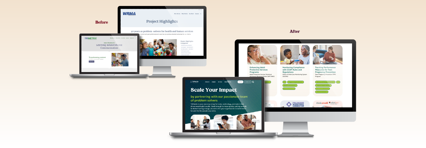
Note: You’ll be taken to TriMetrix’s newly redesigned website, a project where I shaped the strategy, led the design, and guided the development. Feel free to explore the rest of the website.
I also creative directed an 80-second animated promo video as part of the rebrand.
/ Redirecting What’s Possible
Concept Creative Ideas: Despite being around for more than 10 years, our company, TriMetrix, had never gone through its own rebranding. Our branding was blue, green, and gray. We used hexagons just because an executive wanted us to.
When I heard the executives were considering updating the branding but only doing so by changing one color, I spoke up. I pitched that we go through our own full rebranding. We’d been completing rebranding projects for our clients; we should go through it ourselves. I volunteered myself for a comprehensive rebrand of our three brands and a website redevelopment project on top of managing my design team with their client work. The executives gave me the green light; I’d built up a reputation with them through my client work and the growth of our creative team.
/ Guiding Creative Decisions
Present to Clients and Advocate for Creative Ideas: It was unsurprising when color became our first roadblock. During our research steps, we determined navy blue should remain in the color scheme. But I learned early in the executives’ feedback that orange as a contrasting color was going to be a no-go.
Throughout our planning calls, I intentionally built in talking points to make the future orange decision seem less like a scary commitment and more like a business decision. Because it was. We desperately needed a contrasting color as part of our color theme. Accessibility is a service we provide. I wanted to ensure that our designers would be able to easily design within WCAG color contrast ratio requirements.
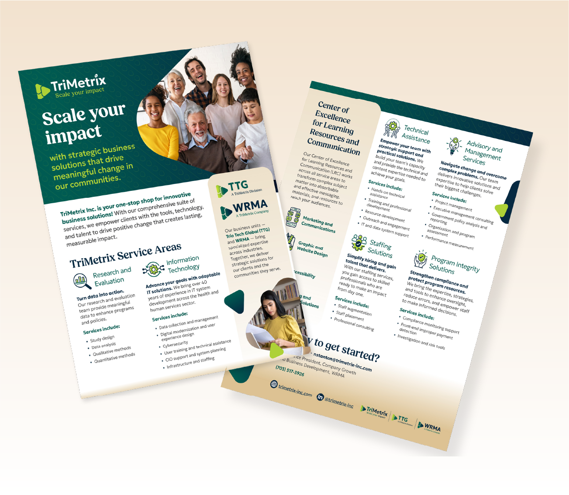
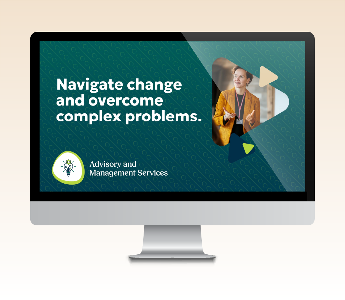
After a later round of visual feedback, I added orange into the logo’s drafts to gauge the current mood on orange. It turned out neither the executive team, nor I, felt the color fit. I then showed them a second complimentary color option I had prepared in case the orange didn’t land: bright green and sepia beige as a duo. It was a hit and accomplished all of our goals and preferences. Without those foundational conversations around orange, bright green would not have landed.
/ Summing the Parts
Manage and Motivate a Small Team: What I love the most about TriMetrix’s new branding is that there’s a piece of each of my creative team in it. I can see each designer’s mark: Subtle patterns from one, tasteful gradients from another, lovely photo and graphic integrations from a third. All within the design system I’d built with them—and unlimited creative possibilities—in mind.